Admin panel customization options
Many aspects of Strapi's admin panel can be customized through the code using the admin panel's /src/admin/app.[tsx|js] entry point file (see project structure).
Before trying to update code to configure any admin panel customization option:
- Rename the default
app.example.[tsx|js]file intoapp.[ts|js]. - Create a new
extensionsfolder in/src/admin/. - If you want to see your changes applied live while developing, ensure the admin panel server is running (it's usually done with the
yarn developornpm run developcommand if you have not changed the default host, port, and path of the admin panel).
By default, Strapi projects already contain another extensions folder in /src but it is for plugins extensions only (see Plugins extension).
The config object found in /src/admin/app.[ts|js] stores the admin panel configuration.
Any file used by the config object (e.g., a custom logo) should be placed in a /src/admin/extensions/ folder and imported inside /src/admin/app.js.
In Strapi 5, the server runs in watch-admin mode by default, so the admin panel auto-reloads whenever you change its code. This simplifies admin panel and front-end plugins development. To disable this, run yarn develop --no-watch-admin (see CLI reference).
Available configuration options
The config object of /src/admin/app.[tsx|js] accepts the following parameters:
| Parameter | Type | Description |
|---|---|---|
auth | Object | Accepts a logo key to replace the default Strapi logo on login screen |
head | Object | Accepts a favicon key to replace the default Strapi favicon |
locales | Array of Strings | Defines availables locales (see updating locales) |
translations | Object | Extends the translations |
menu | Object | Accepts the logo key to change the logo in the main navigation |
theme.light and theme.dark | Object | Overwrite theme properties for Light and Dark modes |
tutorials | Boolean | Toggles displaying the video tutorials |
notifications | Object | Accepts the releases key (Boolean) to toggle displaying notifications about new releases |
Example of a custom configuration for the admin panel:
- JavaScript
- TypeScript
import AuthLogo from "./extensions/my-logo.png";
import MenuLogo from "./extensions/logo.png";
import favicon from "./extensions/favicon.png";

export default {
  config: {
    // Replace the Strapi logo in auth (login) views
    auth: {
      logo: AuthLogo,
    },
    // Replace the favicon
    head: {
      favicon: favicon,
    },
    // Add a new locale, other than 'en'
    locales: ["fr", "de"],
    // Replace the Strapi logo in the main navigation
    menu: {
      logo: MenuLogo,
    },
    // Override or extend the theme
    theme: {
      // overwrite light theme properties
      light: {
        colors: {
          primary100: "#f6ecfc",
          primary200: "#e0c1f4",
          primary500: "#ac73e6",
          primary600: "#9736e8",
          primary700: "#8312d1",
          danger700: "#b72b1a",
        },
      },

      // overwrite dark theme properties
      dark: {
        // ...
      },
    },
    // Extend the translations
    translations: {
      fr: {
        "Auth.form.email.label": "test",
        Users: "Utilisateurs",
        City: "CITY (FRENCH)",
        // Customize the label of the Content Manager table.
        Id: "ID french",
      },
    },
    // Disable video tutorials
    tutorials: false,
    // Disable notifications about new Strapi releases
    notifications: { releases: false },
  },

  bootstrap() {},
};
import AuthLogo from "./extensions/my-logo.png";
import MenuLogo from "./extensions/logo.png";
import favicon from "./extensions/favicon.png";

export default {
  config: {
    // Replace the Strapi logo in auth (login) views
    auth: {
      logo: AuthLogo,
    },
    // Replace the favicon
    head: {
      // Try to change the origin favicon.png file in the
      // root of strapi project if this config don't work.
      favicon: favicon,
    },
    // Add a new locale, other than 'en'
    locales: ["fr", "de"],
    // Replace the Strapi logo in the main navigation
    menu: {
      logo: MenuLogo,
    },
    // Override or extend the theme
    theme: {
      colors: {
        primary100: "#f6ecfc",
        primary200: "#e0c1f4",
        primary500: "#ac73e6",
        primary600: "#9736e8",
        primary700: "#8312d1",
        danger700: "#b72b1a",
      },
    },
    // Extend the translations
    translations: {
      fr: {
        "Auth.form.email.label": "test",
        Users: "Utilisateurs",
        City: "CITY (FRENCH)",
        // Customize the label of the Content Manager table.
        Id: "ID french",
      },
    },
    // Disable video tutorials
    tutorials: false,
    // Disable notifications about new Strapi releases
    notifications: { releases: false },
  },

  bootstrap() {},
};
Locales
To update the list of available locales in the admin panel, use the config.locales array:
- JavaScript
- TypeScript
export default {
  config: {
    locales: ["ru", "zh"],
  },
  bootstrap() {},
};
export default {
  config: {
    locales: ["ru", "zh"],
  },
  bootstrap() {},
};
- The
enlocale cannot be removed from the build as it is both the fallback (i.e. if a translation is not found in a locale, theenwill be used) and the default locale (i.e. used when a user opens the administration panel for the first time). - The full list of available locales is accessible on Strapi's Github repo.
Extending translations
Translation key/value pairs are declared in @strapi/admin/admin/src/translations/[language-name].json files. These keys can be extended through the config.translations key:
- JavaScript
- TypeScript
export default {
  config: {
    locales: ["fr"],
    translations: {
      fr: {
        "Auth.form.email.label": "test",
        Users: "Utilisateurs",
        City: "CITY (FRENCH)",
        // Customize the label of the Content Manager table.
        Id: "ID french",
      },
    },
  },
  bootstrap() {},
};
export default {
  config: {
    locales: ["fr"],
    translations: {
      fr: {
        "Auth.form.email.label": "test",
        Users: "Utilisateurs",
        City: "CITY (FRENCH)",
        // Customize the label of the Content Manager table.
        Id: "ID french",
      },
    },
  },
  bootstrap() {},
};
A plugin's key/value pairs are declared independently in the plugin's files at ./admin/src/translations/[language-name].json. These key/value pairs can similarly be extended in the config.translations key by prefixing the key with the plugin's name (i.e. [plugin name].[key]: 'value') as in the following example:
- JavaScript
- TypeScript
export default {
  config: {
    locales: ["fr"],
    translations: {
      fr: {
        "Auth.form.email.label": "test",
        // Translate a plugin's key/value pair by adding the plugin's name as a prefix
        // In this case, we translate the "plugin.name" key of plugin "content-type-builder"
        "content-type-builder.plugin.name": "Constructeur de Type-Contenu",
      },
    },
  },
  bootstrap() {},
};
If more translations files should be added, place them in ./src/admin/extensions/translations folder.
Logos
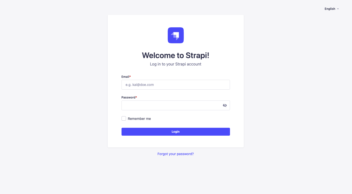
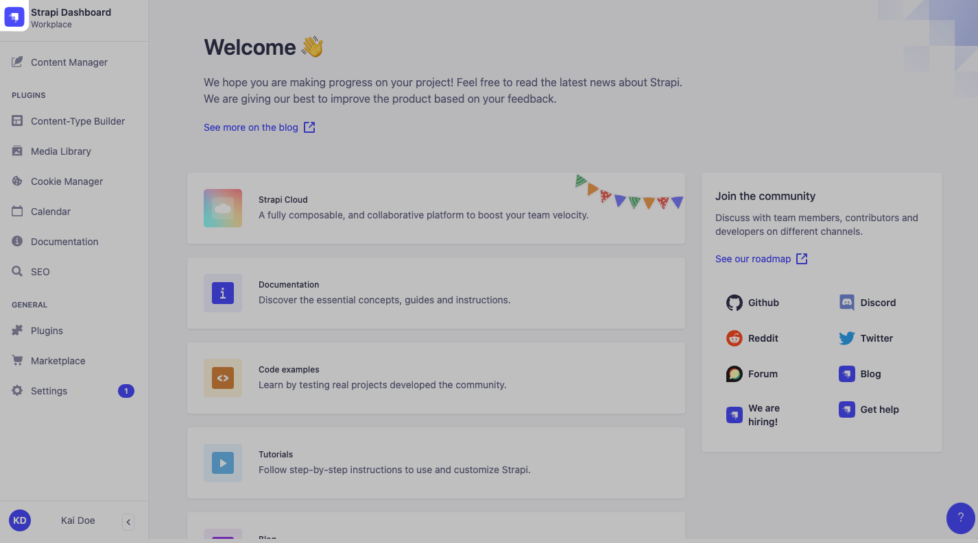
The Strapi admin panel displays a logo in 2 different locations, represented by 2 different keys in the admin panel configuration:
| Location in the UI | Configuration key to update |
|---|---|
| On the login page | config.auth.logo |
| In the main navigation | config.menu.logo |
Both logos can also be customized directly via the admin panel (see User Guide). Logos uploaded via the admin panel supersede any logo set through the configuration files.
Logos location in the admin panel
The logo handled by config.auth.logo logo is only shown on the login screen:

The logo handled by config.menu.logo logo is located in the main navigation at the top left corner of the admin panel:

Updating logos
To update the logos, put image files in the /src/admin/extensions folder, import these files in src/admin/app.[tsx|js] and update the corresponding keys as in the following example:
- JavaScript
- TypeScript
import AuthLogo from "./extensions/my-auth-logo.png";
import MenuLogo from "./extensions/my-menu-logo.png";

export default {
  config: {
    // … other configuration properties
    auth: { // Replace the Strapi logo in auth (login) views
      logo: AuthLogo,
    },
    menu: { // Replace the Strapi logo in the main navigation
      logo: MenuLogo,
    },
    // … other configuration properties

  bootstrap() {},
};
There is no size limit for image files set through the configuration files.
Favicon
To replace the favicon:
-
Create a
/src/admin/extensions/folder if the folder does not already exist. -
Upload your favicon into
/src/admin/extensions/. -
Replace the existing favicon.png|ico file at the Strapi application root with a custom
favicon.png|icofile. -
Update
/src/admin/app.[tsx|js]with the following:./src/admin/app.jsimport favicon from "./extensions/favicon.png";
export default {
config: {
// replace favicon with a custom icon
head: {
favicon: favicon,
},
},
}; -
Rebuild, launch and revisit your Strapi app by running
yarn build && yarn developin the terminal.
This same process may be used to replace the login logo (i.e. AuthLogo) and menu logo (i.e. MenuLogo) (see logos customization documentation).
Make sure that the cached favicon is cleared. It can be cached in your web browser and also with your domain management tool like Cloudflare's CDN.
Tutorial videos
To disable the information box containing the tutorial videos, set the config.tutorials key of the src/admin/app.[tsx|js] file to false.
Releases notifications
To disable notifications about new Strapi releases, set the config.notifications.releases key of the src/admin/app.[tsx|js] file to false.
Theme extension
Strapi applications can be displayed either in Light or Dark mode (see administrator profile setup in the User Guide), and both can be extended through custom theme settings.
To extend the theme, use either:
- the
config.theme.lightkey for the Light mode - the
config.theme.darkkey for the Dark mode
The default Strapi theme defines various theme-related keys (shadows, colors…) that can be updated through the config.theme.light and config.theme.dark keys in ./admin/src/app.js. The Strapi Design System is fully customizable and has a dedicated StoryBook documentation.
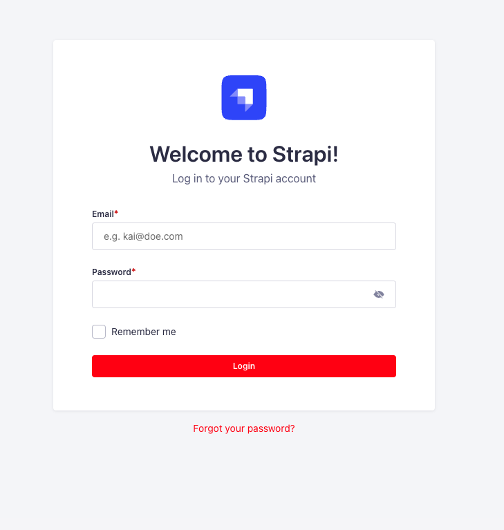
Example: Customizing some admin panel colors:
With the following code example, buttons and links that would use some primary colors will be displayed in red, as shown in the example screenshot:
- JavaScript
- TypeScript
export default {
  config: {
    theme: {
      light: {
        colors: {
          primary600: "red",
          buttonPrimary500: "red",
          buttonPrimary600: "red",
        },
      },
    },
  },
  bootstrap() {},
};
import type { StrapiApp } from "@strapi/strapi/admin";

export default {
  config: {
    theme: {
      light: {
        colors: {
          primary600: "red",
          buttonPrimary500: "red",
          buttonPrimary600: "red",
        },
      };
    },
  },
  bootstrap (app: StrapiApp) {},
}
